See What Financial Clarity Looks Like
Wondering what working with Thrive Interests actually looks like? Below are a few sample reports pulled from real Power BI dashboards. Each is designed to help business owners see their performance clearly and make confident, data-driven decisions — without a full-time CFO.
Note: These reports are only templates — your dashboards will be fully customized to reflect your business’s structure, goals, and industry. Whether you want a simple P&L view, custom KPI tracking, or detailed financial modeling, we build every report to fit your needs.

Financial Overview Dashboard
A high-level snapshot of your business performance — all in one place. Quickly see your revenue, COGS, expenses, and net profit, with dynamic visuals for tracking trends and comparing financial health over time.
Key Features:
- Real-time financial metrics
- Interactive filters (year, month, customer, revenue category)
- Visuals that spotlight areas of opportunity and concern
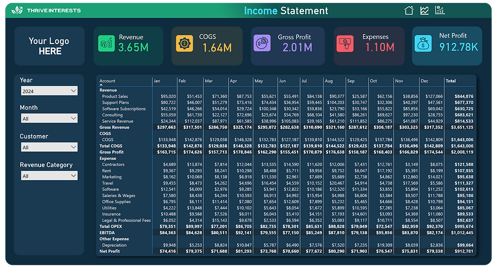
Income Statement Dashboard (P&L)
A fully interactive profit and loss view — designed to replace static spreadsheets. This live report breaks down your revenue and expenses by category and tracks changes month-over-month to help you stay ahead of the curve.
Key Features:
- Drillable income and expense data
- Gross profit, OPEX, and net profit insights
- Easy month-to-month comparisons

Prior Year Comparison
How does this year’s performance compare to last year? This report gives you visual comparisons of revenue, expenses, gross profit, and net profit — so you can measure progress, spot seasonal trends, and forecast more accurately.
Key Features:
- Year-over-year financial comparison
- Visual breakdowns for faster decision-making
- Helps identify growth patterns and spending shifts